You know what, fuck you [un-Jags uar icon]
Submitted 1 year ago by TheBat@lemmy.world to [deleted]
https://lemmy.world/pictrs/image/c1e5def3-4f79-4ee4-b74e-3672dac8df0e.png
Comments
m_f@midwest.social 1 year ago
Viking_Hippie@lemmy.world 1 year ago
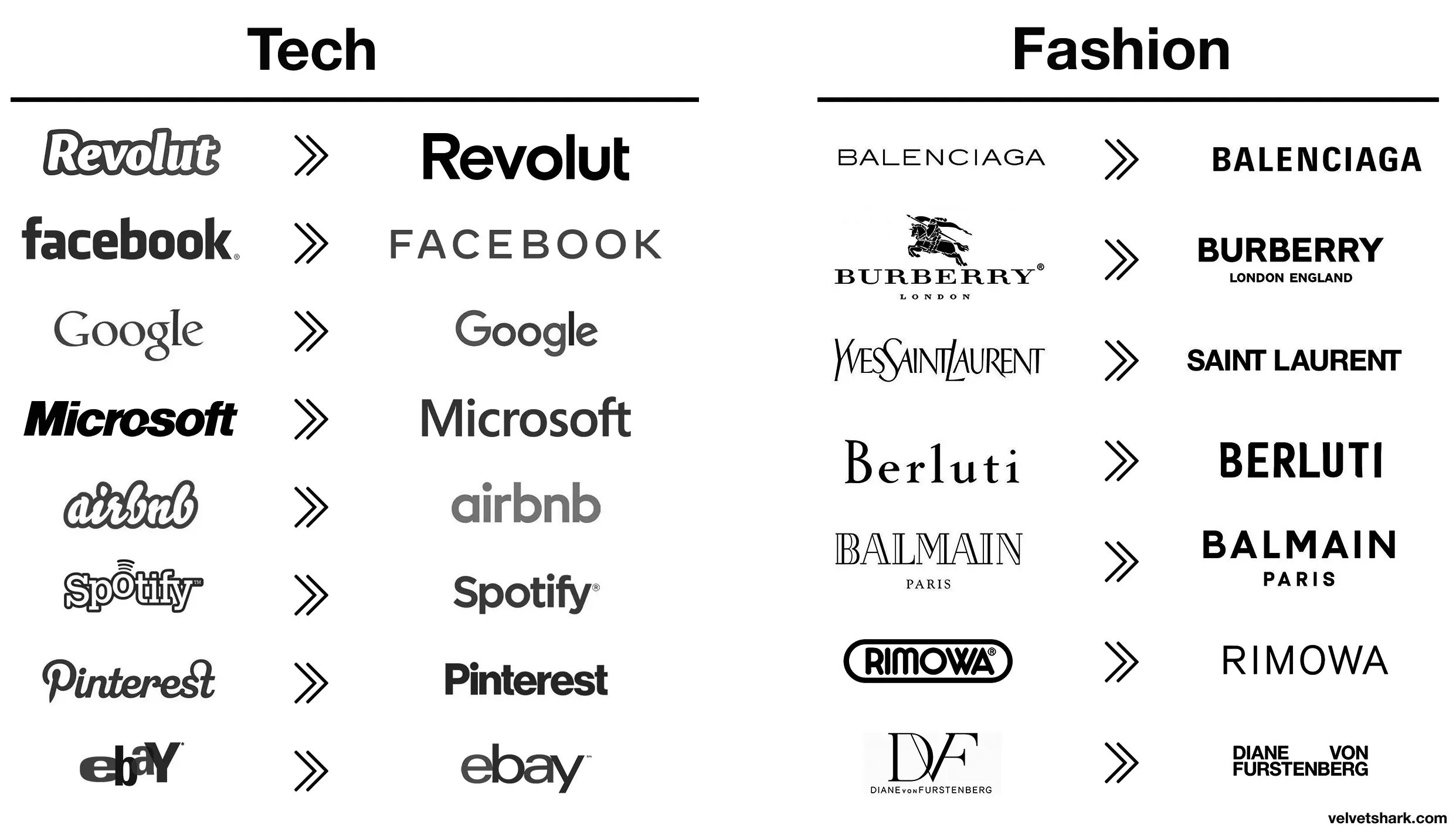
Better:
- Revolut (though a fintech company named after a revolution lacking the charge at the end is still moronic in several ways)
- airbnb (from awful to meh)
- Spotify (same)
Worse:
- Pinterest (original fit the platform and what it is/was pretty much perfectly. Current is meh)
- eBay (both are bad IMO, but at least the original was bad in a playful and eye-catching way. The new one is just more meh
- Burberry (the stag was notable and signalled a history of old-fashioned quality that’s suitably rugged. The new one is meh AND insecure about people knowing which London they’re from)
- Rimova (yet another fashion brand apparently afraid of being noticed
- DF (from one of the best and most fashion-appropriate logos to an absolute eyesore and kerning nightmare that invites vandalism)
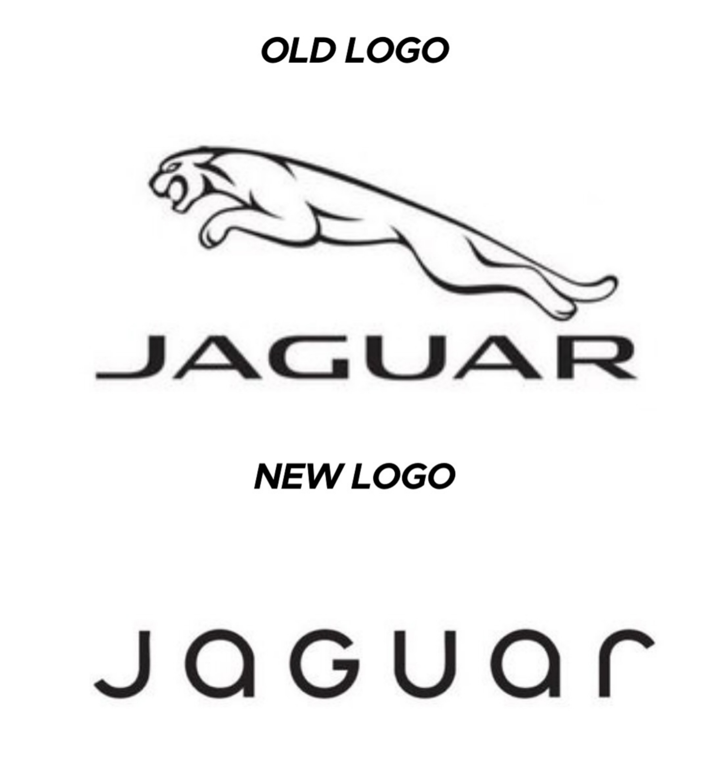
- Jaguar (From absolutely iconic and great in every way to even uglier than the new DF one. I hope whomever came up with that got both fired and beaten and I’m a pacifist.)
The rest just go from meh to slightly different meh 🤷
naught101@lemmy.world 1 year ago
I liked the old aibnb one.
Microsoft went from “boring with a bit of attitude” to just plain boring
Zwiebel@feddit.org 1 year ago
DF gets points dedacted for missing the ü dots on both, looks absolutely stupid to a german speaker
FelixCress@lemmy.world 1 year ago
Spot on.
electric@lemmy.world 1 year ago
Those old fashion logos are actually sick. Concerning that an industry that sells style would make these their logos.
Bezier@suppo.fi 1 year ago
I wonder how much correlation there is between logo blandification and being owned by giant corporations.
RememberTheApollo_@lemmy.world 1 year ago
All these minimalist labels save .0005¢ every time they’re printed, probably even more on promo booths, banners, and the like.
BrowseMan@sh.itjust.works 1 year ago
Aaaah then indeed that makes sense (and this is not ironic).
Rinox@feddit.it 1 year ago
I think it has more to do with being readable on small screens, like mobile phones. It still doesn’t make sense to me to completely remove your logo and replace it with a sans serif name of your company like jaguar just did.
FangedWyvern42@lemmy.world 1 year ago
Spotify and EBay made the right choices here, the new logos are way better.
AusatKeyboardPremi@lemmy.world 1 year ago
It is subjective, I liked the old eBay logo more, but dislike the old Airbnb one.
AnUnusualRelic@lemmy.world 1 year ago
Well, they certainly fin in better with all the others.
SuperSaiyanSwag@lemmy.zip 1 year ago
Slightly misleading without showing the color, only slightly though
selokichtli@lemmy.ml 1 year ago
What’s the reasoning behind? Or just a trend?
mister_flibble@lemm.ee 1 year ago
I fucking hate this minimalist design trend more than it is probably reasonable to hate an aesthetic. It’s got the personality of unfinished drywall.
Zink@programming.dev 1 year ago
Honestly I think unfinished drywall has more personality. It’s utilitarian and rough around the edges, without the shiny surface veneer.
That new Jaguar logo is like somebody took a beautiful old house full of exposed brick and wood work and put a coating of white paint over everything.
SubArcticTundra@lemmy.ml 1 year ago
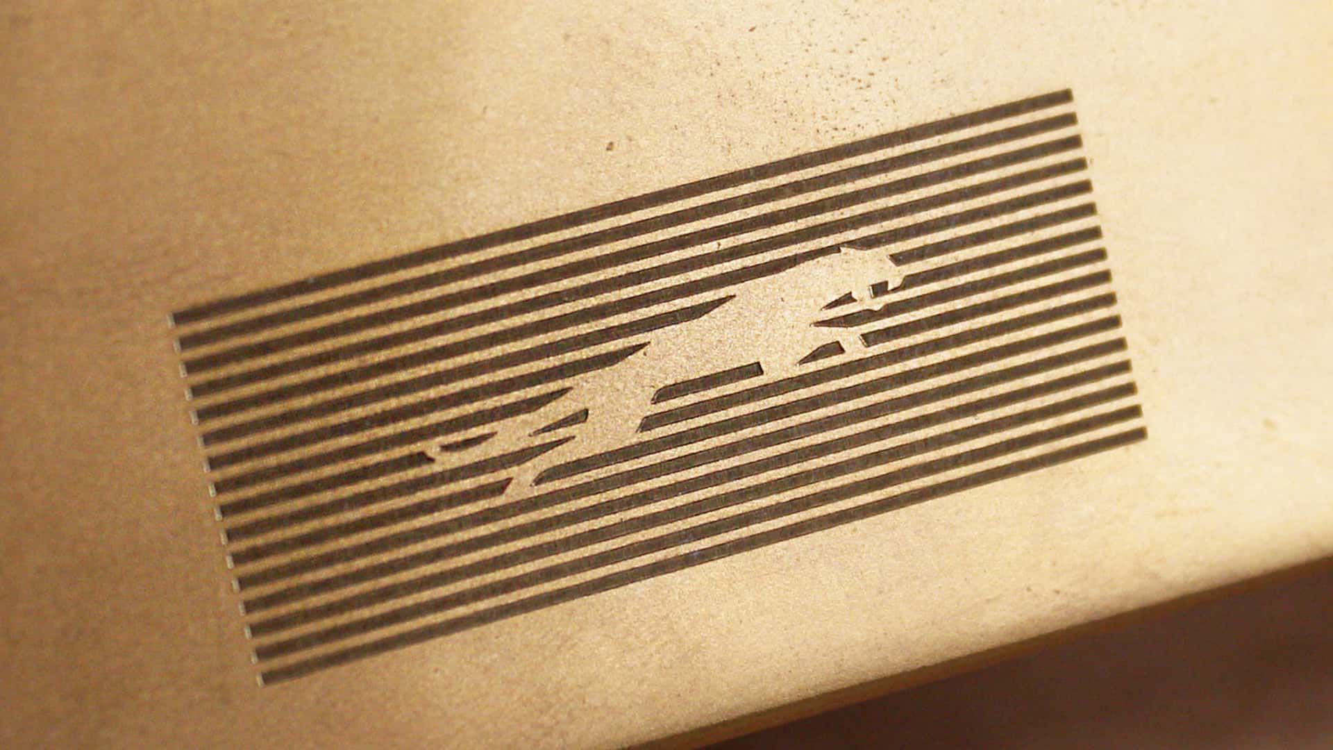
The pouncing jaguar is so visually powerful
Kusimulkku@lemm.ee 1 year ago
It should be those puprple and yellows of Corporate Memphis
droporain@lemmynsfw.com 1 year ago
The younger generation barely reads let alone reads cursive. This is next generation marketing you aren’t the audience I imagine.
mister_flibble@lemm.ee 1 year ago
Even if that’s what’s going on (or at least that assumption on the part of the design team is what’s going on), this is shit. You know what requires even less reading than script OR basic print? THE FUCKING PICTURE OF THE FUCKING JUNGLE CAT.
Asidonhopo@lemmy.world 1 year ago
That’s what it is, isn’t it. Retirement in their design department, new hires and this is a Millenial message marketing to Gen Zers (and Alphas too, automotive preference starts early)
LaLuzDelSol@lemmy.world 1 year ago
HerrVorragend@lemmy.world 1 year ago
Top looks like it belongs on a nice sports car.
Bottom looks like you can find it on a new Multipla.
conciselyverbose@sh.itjust.works 1 year ago
That font is awful. The G looks completely unrelated to any of the other letters.
BlitzoTheOisSilent@lemmy.world 1 year ago
The G looks completely unrelated to any of the other letters.
I see this, since half of the letters appear to be uppercase, and the other half lowercase:
JaGUar
The_Picard_Maneuver@lemmy.world 1 year ago
Bottom text looks like it belongs on some short-lived product for flavoring water or a gas station energy drink.
skarn@discuss.tchncs.de 1 year ago
No, the Multipla deserves better.
FauxPseudo@lemmy.world 1 year ago
I would have failed every design class I took in college if I submitted that. Why such wide kerning? Why lower case but upper G? Why so round? Why so completely unreadable at a distance because of micro serifs? There isn’t one good design element in this.
nepenthes@lemmy.world 1 year ago
It doesn’t say “car” at all either; no elegance or prestige. It looks like a logo for bottled water or something.
hakunawazo@lemmy.world 1 year ago
Asidonhopo@lemmy.world 1 year ago
I think they want people to focus on the “agua” and the j and r are just little accents on it like its word art rather than a logo. Like, I literally picture the marketing weirdos at the meeting going off like this.
FauxPseudo@lemmy.world 1 year ago
The “a” is the worst part for me. You can’t see those little stubbs at a distance. So it reads JoGuor at a distance. They didn’t just fail to create a good logo, they failed to preserve the name. One bit of advice I always give is “imagine this logo on the back of a golf card or a Pride brochure. If the logo isn’t crisp and readable in black and white in a 1/2 inch square then it sucks.” This design fails that test. Not just because of the messed up “a” but the wide spacing makes those unreadable "a"s even smaller than if the letters weren’t so widely spaced.
RestrictedAccount@lemmy.world 1 year ago
It’s not joguor?
FauxPseudo@lemmy.world 1 year ago
It might just be depending on how far away you are
Kusimulkku@lemm.ee 1 year ago
>New logo is soulless slop
Every single company
Zacryon@feddit.org 1 year ago
Makes it easier to forget them and not being able to keep them apart. That’s really great for us. Less ads in our brains.
JayDee@lemmy.ml 1 year ago
the secret is that all logos are soulless slop. you just become attached to the old ones due to familiarity. when that familiarity is removed, you see it for what it really is.
Passerby6497@lemmy.world 1 year ago
My favorite shit logo redesign is
KИ
I can’t believe anyone thought that was a good logo…
deadbeef79000@lemmy.nz 1 year ago
Somewhere in Jaguar HQ, a marketing firm convinced the CxO suite that the most pressing problem facing the company was that the logo was wrong. So, in the interests of the shareholders they write off the goodwill value of the existing brand and dump millions of euro into this.
slaacaa@lemmy.world 1 year ago
Mr_Blott@feddit.uk 1 year ago
Hah don’t worry, the existing brand is utterly fucked now. One of the worst, most unreliable and badly made cars on the market
Viking_Hippie@lemmy.world 1 year ago
One of the worst, most unreliable and badly made cars on the market
But enough about Tesla.
deadbeef79000@lemmy.nz 1 year ago
It’s still a prestige brand in the eyes of the masses. It might not be as good t brag about den at the country club but letting the plebs know that you can afford a car that costs more than their house still has value.
flambonkscious@sh.itjust.works 1 year ago
But who cares?
Sure, the idiots at jaguar are flushing their brand, but who cares?!? It’s their shit pile to destroy, after all…
deadbeef79000@lemmy.nz 1 year ago
It more that there’s a grift happening. What’s the odds that theres a tenuous conflict of interest here with the various business and executives concerned? It’s a small cub and everyone scratches each other backs.
max_dryzen@mander.xyz 1 year ago
Sparky@lemmy.blahaj.zone 1 year ago
SubArcticTundra@lemmy.ml 1 year ago
Lol well done
Aksamit@slrpnk.net 1 year ago
Wow, they really took their logo from sexy, fast and expensive looking, to looking like an over priced soft drink?
That’s impressive, haha.
AnUnusualRelic@lemmy.world 1 year ago
It looks like an off brand sportswear shirt you’d find on an African market.
AllNewTypeFace@leminal.space 1 year ago
It takes a heroic amount of cocaine to make something so devoid of taste and see it through.
thatKamGuy@sh.itjust.works 1 year ago
/uj Technically this is their new logo:
J a G U a r is just their new typeface (I think that’s the name?); and apparently/allegedly is to make the pronunciation closer to UK English, rather than American.
Either way, though - it’s still…
/j
…pReTtY fArKiN’ sToOoPiD.
Aksamit@slrpnk.net 1 year ago
I would have guessed that was a Puma logo.
Homescool@lemmy.world 1 year ago
Slazenger
A7thStone@lemmy.world 1 year ago
You’re making that up.
Zozano@lemy.lol 1 year ago
You spell stoopid with three O"s. Maybe your the stoopid,
Bezier@suppo.fi 1 year ago
Yeah that’s pretty dummb
dan@upvote.au 1 year ago
typeface (I think that’s the name?);
Logotype.
yax@feddit.org 1 year ago
ICastFist@programming.dev 1 year ago
I love how the new logo could be literally done in less than a minute on fucking microsoft office. They didn’t even bother with a cool looking font, just generic curvy shit
Bezier@suppo.fi 1 year ago
I’m sure they spent an unreasonable amount of time getting that ugly font look just right.
The_v@lemmy.world 1 year ago
It cost at last 50 million in a fancy name designer fees.
FangedWyvern42@lemmy.world 1 year ago
They went from luxury car company to mediocre smartphone brand
pseudo@jlai.lu 1 year ago
The font is ugly.
AeonFelis@lemmy.world 1 year ago
Jaguaren’t
szczuroarturo@programming.dev 1 year ago
I dont understand modern logos principles. How tf is that recognizable. Also animals are fun. Stop getting rid of animals from icons.
slaacaa@lemmy.world 1 year ago
srecko@lemm.ee 1 year ago
You were supposed to remove the text…
AWittyUsername@lemmy.world 1 year ago
Soon there will be no color, no originality.
Just a single font to use everything will be homogeneous and consolidated. Minimal, inoffensive and focused grouped to appeal to everyone and also no one.
Movies, music, games, brands.
dgmib@lemmy.world 1 year ago
That looks like marketing, let their six-year-old design the logo. Half the letters or lowercase and half are uppercase.
EtAl_isGitch@lemmy.world 1 year ago
Their logo doesn’t have a jaguar and their car commercials don’t have any cars. Fuck it, whatever
LiamMayfair@lemmy.sdf.org 1 year ago
A design consultant probably sent Jaguar a six-figure bill for this new logo, you know.
Diddlydee@feddit.uk 1 year ago
[deleted]spankmonkey@lemmy.world 1 year ago
Making their logo ugly is going woke?
BedSharkPal@lemmy.ca 1 year ago
Woke just means bad now to the less mentally inclined it seems.
Mouselemming@sh.itjust.works 1 year ago
You’d probably get fewer of the lazy tldr down votes if you put quotation marks around “gone woke” to distance yourself from it.
FelixCress@lemmy.world 1 year ago
Changing things for the sake of changing things. Like Microsoft with every moronic “update”.
temmink@feddit.org 1 year ago
JaGUar
Crafter72@lemmy.dbzer0.com 1 year ago
Awh hell nah, no more JAAAAAAAAAAG :(
Agent641@lemmy.world 1 year ago
JOGUOR
Mwa@lemm.ee 1 year ago
I hate these new logos these corporations make.
anarchrist@lemmy.dbzer0.com 1 year ago
I too am something of a joguar
iii@mander.xyz 1 year ago
“We’re a tech company now!” logo