You’re all making fun of it but this new style did exactly what it intended to do. Everyone is talking about them now.
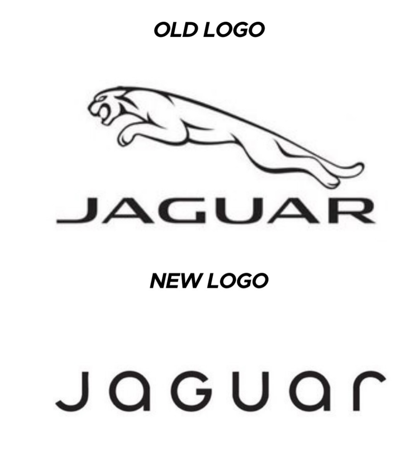
You know what, fuck you [un-Jags uar icon]
Submitted 1 year ago by TheBat@lemmy.world to [deleted]
https://lemmy.world/pictrs/image/c1e5def3-4f79-4ee4-b74e-3672dac8df0e.png
Comments
Atomic@sh.itjust.works 1 year ago
LiamMayfair@lemmy.sdf.org 1 year ago
Yeah, for a whole 2 hours, until everyone moves on to bitch about the next thing and then they’re stuck with the shitty logo no-one recognises for long after that.
Atomic@sh.itjust.works 1 year ago
Why would no one recognize it? Hardly the first time they’ve changed their logo.
ICastFist@programming.dev 1 year ago
If only they sold stuff that the people talking about it could afford in the first place, maybe that’d boost their sales.
Atomic@sh.itjust.works 1 year ago
First step is increasing brand recognition. No one will buy if they don’t know you exist.
naught101@lemmy.world 1 year ago
JaGUar
daqu@feddit.org 1 year ago
They kindly did the needful with the logo.
patak@lemmy.world 1 year ago
oversimplifying logoes and stuff makes me rage, especially this
tallpaul@lemm.ee 1 year ago
Skoda have done something similar with their latest offering. No Skoda badge, no radiator grill. Just SKODA in a boring font.
Sam_Bass@lemmy.world 1 year ago
Just buy an old style one and replace the new one with it if you just have to have a jag
Luvs2Spuj@lemmy.world 1 year ago
I read this as joguar when I first scrolled by.
deltreed@lemmy.world 1 year ago
They probably paid 10 million for that and a 12 year old. Liked have made it.
fmstrat@lemmy.nowsci.com 1 year ago
Tata cat.
Insiders might get it.
Thrashy@lemmy.world 1 year ago
rimshot
AFC1886VCC@reddthat.com 1 year ago
I prefer the new font but dislike the removal of the jaguar logo.
Helkriz@lemmy.world 1 year ago
What are they selling now 🙄
DrownedRats@lemmy.world 1 year ago
Cheap vapes and gucchi knock offs apparently.
qjkxbmwvz@startrek.website 1 year ago
If I wanted to give it a bold facelift I’d just use the top one and remove the letters. Gives it an arrogant, “if you have to ask what this is…” vibe, which is probably a good thing for them.
inbeesee@lemmy.world 1 year ago
They’re trying to impress investors with ‘serious’ design, not stand out with a unique one
zalgotext@sh.itjust.works 1 year ago
Nothing says “serious” like mixing upper and lower case letters yet keeping them all the same height, so it looks like a third grader wrote it
inbeesee@lemmy.world 1 year ago
Yeah, it DOES look like shit, but tiger-less and safe shit