Steam UI genuinely fucks, and if you’re suggesting it should be homogenized into the bland, emotionless material design full of dark patterns that every other web experience has turned into… then you, sir, can go to hell
Steam has the best UI
Submitted 1 year ago by m_f@midwest.social to [deleted]
https://midwest.social/pictrs/image/80fcb20b-b1de-4fd2-a75b-a3447f452589.webp
Comments
recklessengagement@lemmy.world 1 year ago
PotatoesFall@discuss.tchncs.de 1 year ago
Good design doesn’t have to be bland, and what does this have to do with dark patterns?
IMO the desktop Steam client as well as the gamescope have some pretty confusing UI. Once you get used to it it’s fine but that’s the case for any shitty UI. Except Gamescope, which is buggy to traverse by controller (which is what it was designed for lol)
UprisingVoltage@feddit.it 1 year ago
Yeah, dark patterns are NOT good UX, even though unfortunately it’s present everywhere nowdays.
Steam’s UI/UX can be better, more ordered, coherent and standardized. This does not mean that it has to incorporate dark patterns.
CptBread@lemmy.world 1 year ago
Sure but bland is often that kind of design often ends up as…
ThirdConsul@lemmy.ml 1 year ago
Steam is a bastard child of monopoly. They don’t innovate because they barely have any competition.
And to this dya one cant fucking increase font size in Steam. Fuck them, I’m old, the letters are a little to small for me. Even fucking browsers allow for font changes, but not Steam. Fuck them.
Skullgrid@lemmy.world 1 year ago
That’s right, that’s why they worked their asses off improving Linux support, designing new controllers and the steam deck.
AnUnusualRelic@lemmy.world 1 year ago
And they still refuse to let their software be handled properly by the window manager. It’s really annoying.
kopasz7@sh.itjust.works 1 year ago
There is a scaling factor for the GUI (by default it checks your monitor’s DPI).
pixeltree@lemmy.blahaj.zone 1 year ago
They don’t innovate because they barely have any competition
You can hate steam all you want, and people fanboying over them can be pretty annoying, but this is, imo, demonstrably false. They’ve pretty consistently been innovating and trying new things, even when they don’t end up working well. They were very early into voice chat, back in the day your options were more or less skype, possibly mumble, and that pleas pretty much it. Relatively easy, integrated voice chat was was innovative. Similarly, being able to to stream your game to friends. I don’t think this feature ever got all that use and it never worked that well for me, but it was really ahead of it’s time imo. The way they handle family sharing has been both unique and consumer friendly, and also they haven’t just sat on it, they’ve improved it. They’ve implemented a way to play local co-op games remotely even. One of the biggest innovations imo has been how they handle being signed in on multiple computers and being able to stream games from one computer to another. Hell, they’ve even innovated with hardware, with the steam link being very ahead of it’s time in that regard. I’m not going to mention proton, steamOS and the deck, someone else surely has or will.
Look, we should never trust a company to be ethical or feel like they’re a friend or one our side or shit like that, but I do appreciate how much new stuff they’ve pushed for over the years
Matriks404@lemmy.world 1 year ago
Shouldn’t Steam client scale with whatever DPI scaling you have set up?
SubArcticTundra@lemmy.ml 1 year ago
It makes me feel like it’s still 2011 and I am here for it
butter@midwest.social 1 year ago
I like Material Design. It helps unify the experience of android.
Evotech@lemmy.world 1 year ago
This is why they are actually profitable and roll out new features. Because they don’t spend time redesigning old shit every time they have a new design in mind.
azalty@jlai.lu 1 year ago
I thought it was because they made gambling open to minors and took 30% of all game sales
ignotum@lemmy.world 1 year ago
Gambling? Don’t give steam credit for EAs hard work!
Another_earthling@lemmy.world 1 year ago
Last time I said something similar people down voted my comment all the way lol
tino@lemmy.world 1 year ago
there is a thing called shared front-end components, so each time you need to add a button on an interface, you don’t need to recreeate a new one and it looks consistent for the user. And Steam is known for being super slow at rolling out anything.
Evotech@lemmy.world 1 year ago
Your still have to update tests and implement shared components in the first place.
Skullgrid@lemmy.world 1 year ago
It’s called working software sweaty, you get some design inconsistencies when you focus on creating new stuff led by the development team instead of the human personification of Helvetica
peetabix@sh.itjust.works 1 year ago
I always get sweaty when working software.
Skullgrid@lemmy.world 1 year ago
it’s summer, take off the “programming socks”
MonkderVierte@lemmy.ml 1 year ago
Incoporating multiple styles sounds like more work than it’s worth. Can we talk about tech debt?
FangedWyvern42@lemmy.world 1 year ago
Steam has a bad UI, but at least I can actually find what I’m fucking looking for. I like GOG, but holy shit Galaxy is awful. I ended up having to use the website to look for Icewind Dale because the search function doesn’t actually show you results from the store.
JDPoZ@lemmy.world 1 year ago
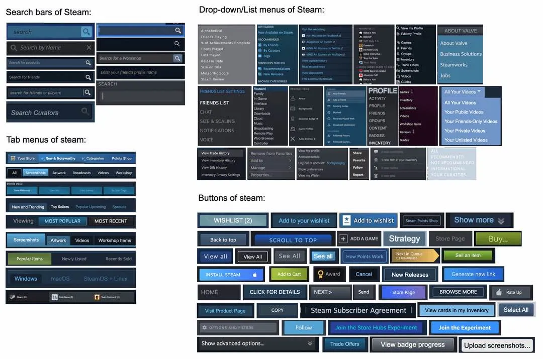
It’s not flat out “bad,” but it IS visually inconsistent when it comes to their overall design system element library… but their visual hierarchy, their arrangement of said elements, and layout - is overall pretty well done.
My personal biggest gripe is less about element appearance, but more on how inconsistent their tab layout ends up being from page to page.
When browsing, I always struggle to find a couple of elements - usually something from the specific set of tabs I want to navigate to like the “community” home, my wishlist items, or the shopping cart.
…But really my very biggest gripe is on my Steam Deck. I have the mod for allowing customized animated grid images… and when I go to the Collections section, the loading of those images grinds browsing to a nearly unusable halt.
JDPoZ@lemmy.world 1 year ago
Wanted to better illustrate my point about asset modernization, here’s an example of what I’m talking about : This is a 7.45MB animated GIF embedded among several others on the page for Helldivers 2 store page on Steam : Image
Here’s that same animation converted into an animated WEBP at 789KB… (I did an AVIF at 215KB with default settings from some random online conversion tool, but apparently Lemmy won’t allow those to be embedded / shown directly) : Image
It is literally ~10% the size, looks identical (could make better with less compression for just a few KB more), loads faster, and will play back in everything except e-machines from the late 1990s.
Additionally, modern formats support things like wider color gamut - which means you can create HDR assets.
RobotZap10000@feddit.nl 1 year ago
Would it really be better to have as few unique bits as possible? I think that it’s great to be able to tell at a glance what part of Steam you’re on. It’s a program with many features.
Micromot@feddit.org 1 year ago
Also the things related to one thing are mostly the same like buy and add to cart
ocean@lemmy.selfhostcat.com 1 year ago
Some woman did a YouTube vid on this and how she would unify the design. This is a mess
Takumidesh@lemmy.world 1 year ago
I disagree, I like that the menus, icons, and buttons are visually distinct.
I absolutely hate websites where every button looks the exact same and I can only tell the difference by analyzing the page Terminator style.
Death to ui frameworks, death to bootstrap, long live custom UIs with a design language.
MrScottyTay@sh.itjust.works 1 year ago
It has awful maintainability if you have to create a new component every time you want a new button, instead of reutilising old code in a way that changing the way one of them works should change all of them. It would also make the devs able to work faster and get to just focus on the main stuff they are working on.
Steam seems to have a lot of different Devs attempting to do their own thing from scratch again and again. And that’s bad. I imagine their codebase is an absolute nightmare.
kautau@lemmy.world 1 year ago
Sure but this post proves there isn’t a design language. Besides “dark sans serif text” many elements are disjointed. It’s fine and it works, but it’s clear each feature was done by a separate team with their own decisions of what said feature should look like
TheBat@lemmy.world 1 year ago
Based
morrowind@lemmy.ml 1 year ago
Juxtapposed. She’s done videos on a lot of popular apps. I don’t agree with a lot of decisions she makes, but her comments seem to love it
ocean@lemmy.selfhostcat.com 1 year ago
What decisions you don’t agree with? It’s just fun to watch UX ideas :)
mrvictory1@lemmy.world 1 year ago
Steam revamped its UI, it’s still not consistent but some elements in this picture are no more
BmeBenji@lemm.ee 1 year ago
This is one of those big “Oh no! Anyways…” kinda moments.
Like someone at Epic or Microsoft or something was like “but Steam’s graphics aren’t as good as our graphics!”
… and?
Juigi@lemm.ee 1 year ago
U can make any ui look like dogshit if you do this lol
stebo02@lemmy.dbzer0.com 1 year ago
you’d expect them to reuse at least some UI elements
Vince@lemmy.world 1 year ago
If all the buttons and menus all looked the same wouldn’t it be a lot harder to find what you’re looking for? Wouldn’t you want some things to stand out, especially if that’s what your users are used to?
beerclue@lemmy.world 1 year ago
I think the issue is consistency. Not making everything look the same, but have a common design language.
eager_eagle@lemmy.world 1 year ago
Jarix@lemmy.world 1 year ago
Barf. I hate it. No ty
dilroopgill@lemmy.world 1 year ago
it just works, its annoying at first, but nothing really changes, you learn something once and you’re set
namingthingsiseasy@programming.dev 1 year ago
This is the thing UI designers never understand[0] - if you keep changing shit around, nobody will ever figure out how to use it. If you keep it consistent and don’t make dramatic changes, users will have a much easier time using it because they don’t have to keep relearning the damn thing. Consistency is the most effective UI paradigm.
[0] or to put it in better terms, they’re paid to not understand this so they can justify their jobs…
Sunshine@lemmy.ca 1 year ago
It still looks fine to me.
Churbleyimyam@lemm.ee 1 year ago
Vs lingscars.com
Rin@lemm.ee 1 year ago
One day, imma rent a car using that fr
Kolanaki@yiffit.net 1 year ago
Makes me wonder: Can you still mod the UI? Like back when it was still the OG green UI, you could customize it with skins. You can’t still do that with the modern UI can you? 🤔
mrvictory1@lemmy.world 1 year ago
You can theme Steam externally github.com/tkashkin/Adwaita-for-Steam
GeneralEmergency@lemmy.world 1 year ago
I personally love when the world’s largest police force outsourcesWhen you have a monopoly you don’t have to try. Add in years of Stockholm syndrome (as you can see with the amount of brainwashed G*mers in the comments) and I’m surprised Steam isn’t in Comic Sans.
JakJak98@lemmy.world 1 year ago
See the base app is decent, but I still feel the old steam UI was better. At least that UIs in game overlay actually worked more often, and didn’t use crappy icons for nav
kautau@lemmy.world 1 year ago
I miss the native UI with the og steam green colors, honestly I wish they’d switch back to that instead of everything being a web view
Kusimulkku@lemm.ee 1 year ago
I hate how Steam has bloated over time.
passiveaggressivesonar@lemmy.world 1 year ago
One of those is bound to tickle your fancy
SubArcticTundra@lemmy.ml 1 year ago
It’s designed as if it was still on Windows 7
Matriks404@lemmy.world 1 year ago
Good. I don’t want new ‘modern’ shitty flat UI.
PanArab@lemm.ee 1 year ago
Awful UI with awful colour scheme. I still love my Steam Deck though
Caitlyynn@lemmy.blahaj.zone 1 year ago
At least I know exactly where I am, just by how the menu looks
Jumuta@sh.itjust.works 1 year ago
and somehow it’s still one of the least shitty feeling megacorp websites
brucethemoose@lemmy.world 1 year ago
Because it’s actually trying to serve the user, kinda.
TheBat@lemmy.world 1 year ago
How else are you going to give money to them if you can’t discover games on sale?
thedirtyknapkin@lemmy.world 1 year ago
that’s probably because it’s not a megacorp, but a private company owned by a single person. not a corporation at all.
there’s a big difference. a corporation is owned by a board of investors. those companies are legally obligated to provide maximum return for their investors. corporations have been sued for being “too charitable to their customers” rather than maximize profits. a private company can do whatever it wants at the whims of it’s owner. in this case Gabe Newell actually kind of wants to create a decent experience because that’s what he believes has created their market dominance. he’s right.
corporations like Ubisoft and ea are legally obligated to squeeze you for every penny in their platforms.
Jumuta@sh.itjust.works 1 year ago
what word would you use then? megaentity? megabusiness?