
I don’t even know what it’s called, but I really hope it goes the way of Comic Sans
At least comic sans is easy on the eyes. easy to read.
Submitted 21 hours ago by cannedtuna@lemmy.world to [deleted]
https://lemmy.world/pictrs/image/c76a2384-cce5-4f63-9972-a25db621e206.png
I don’t even know what it’s called, but I really hope it goes the way of Comic Sans
At least comic sans is easy on the eyes. easy to read.
You might need new glasses.
That is literally one of comic sans upside. Its objectively speaking easy to read. Its one of the better fonts for people with dyslexia and reading difficulties.
People hate on it because memes and ignorance. Also the absolute over use making people sick of it. But those are subjective things.
“I hate AI slop so much I use AI slop to show off how much I hate it.” Why are people like this?
LOL the box doesn’t even line up on the bottom. What ass.
I like this font. AI didn’t need to make it, but it having made it should not effect your opinion of the quality of the end result.
I swear if AI cured cancer some of y’all would rather let patients die :/
Can’t wait for the word prediction machine to cure cancer. Any day now
I never said it would because it won’t, it’s not actually high tech in that way and we all know it. I was merely highlighting the fact that “It’s AI” has become such a powerful statement in the moral area that it can change people’s opinions on a perfectly fine (if a bit cheesy) FONT. I find that INCREDIBLY stupid.
If if if if if if if if if if
…Or why not just find an original font? It is not like you we’re starved for choice anyway.
I’m sure www.sinisterfonts.com will have a font you’ll like ;).
That Haunted Hill font sparks joy
Oooh, you are definately correct in that assumption! Thanks for the fonts >:)
Comic sans was a sign of a brainless, lazily done piece of work.
AI paint brush font is a sign of a brainless, lazy done piece of work.
How things are made has always impacted how we see the quality of an image. The end result is not what people care about it. Art has never been an objective thing and does not live in a vacuum. Any method that is lazily done becomes viewed as poor quality no matter the medium
And in this case it’s extra strong with all the other effects from AI get associated with it as well. So all the job loss, pollution from diesel backup generators, higher energy usage, control of our lives from tech companies, etc.
It is curing diseases and these people just handwave it away as “that’s not the ai I’m talking about.”
Totally pointless to engage with them.
You can hate font plagiarizing AI without hating cancer-curing AI. The biggest lie is that those are somehow the same thing. No, your slop-manufacturing LLM isn’t going to stumble upon a cancer cure. Stop wasting trillions on the slop machine and actually invest in bespoke, targeted models tuned by competent researchers.
Comic Sans isn’t a bad font, it became hated because of how people were unironically using it for serious stuff I’m pretty sure
I don't think AI made it, the software interpolated it from scraped web content. And for AI to cure cancer, it would have to scrape the notebooks of actual researchers who are about to go public.
AI probably just ripped it off an existing font, anyway.
but I really hope it goes the way of Comic Sans
I use comic sans monospace in my terminal. But I don’t want this shit in my terminal!
It’s whatever chatgpt installed off civit ai’s fonts collection
The letters differ slightly, the 2 E in “THE” and “NEW” or the Cs in COMIC - so it might be hand lettering, possibly done by artificial virtual hands…
I think I’m the only person on earth who can’t tell a “good” font from a “bad” font. I mean I’ve used comic sans to troll people before and think it’s too cartoony for any practical use, but I don’t hate it. This font here just like like paintbrush strokes. I didn’t know how y’all even know its AI. I mean if it wasn’t then it’d be fine, just not useful.
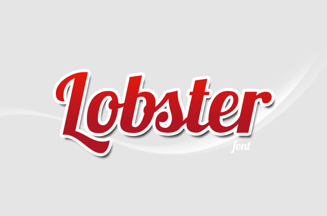
New Lobster
I don’t think I have ever actually seen someone talk about Lobster. Because yes, after learning about that font, I started noticing it EVERYWHERE because it’s a pretty nice font and is free for commercial use.
hey, the red one!
Is it really hard to write a prompt to make it not look like this? Or are people too lazy and just use the first generic slop result that they get?
Drawing attention to this font by denouncing it and giving it subversive appeal is not an effective way to make it go away, so I think OP is secretly promoting it and wants more of it. Nice try, OP: we’re onto your mind games.
Knockoff POSCA marker

BigFanofStuff@lemmy.cafe 20 hours ago
Half of what makes me hate this is that the people making these posters don’t even understand why its wrong :(