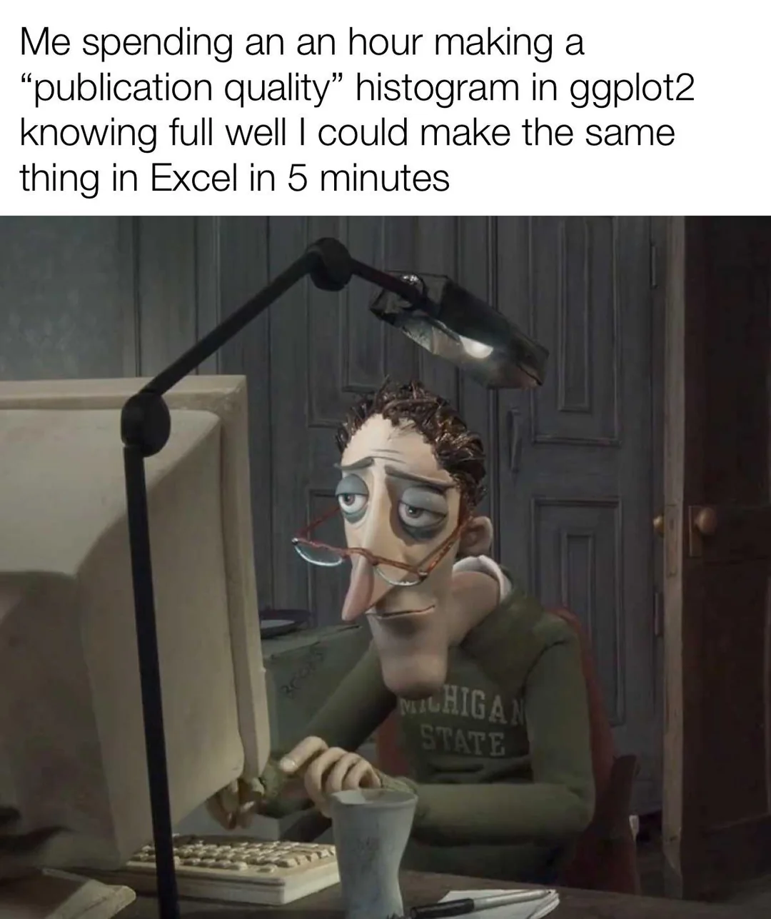
R with the tidyverse package is amazing once you get over the learning curve. It’s so much easier to simply type a few lines of code then to fiddle with the Excel GUI, plus the ability to customize the plot is much, much better in R.
Yes making a simple plot in Excel is relatively easy, but try making something evening remotely complex and it’s terrible. A box plot is a great example of this, 2 lines of plotting code in R for a basic plot but an absolute nightmare to create in Excel.
originalfrozenbanana@lemm.ee 1 year ago
Hot tip - export a basic plot to svg and format it in Inkscape. OBVIOUSLY DO NOT CHANGE ANYTHING THAT MODIFIES THE DATA OR RESULTS but it’s much easier to get a consistent look and feel in Inkscape than ggplot
MTK@lemmy.world 1 year ago
Hotter tip - just make it all in inkscape, no one fact-checks anyway!
thevoidzero@lemmy.world 1 year ago
There’s inkscape plugin to make barplots and piecharts. Why don’t we add for more? Honestly we could even make it just take r code or python code.
pewgar_seemsimandroid@lemmy.blahaj.zone 1 year ago
both foss software, right?