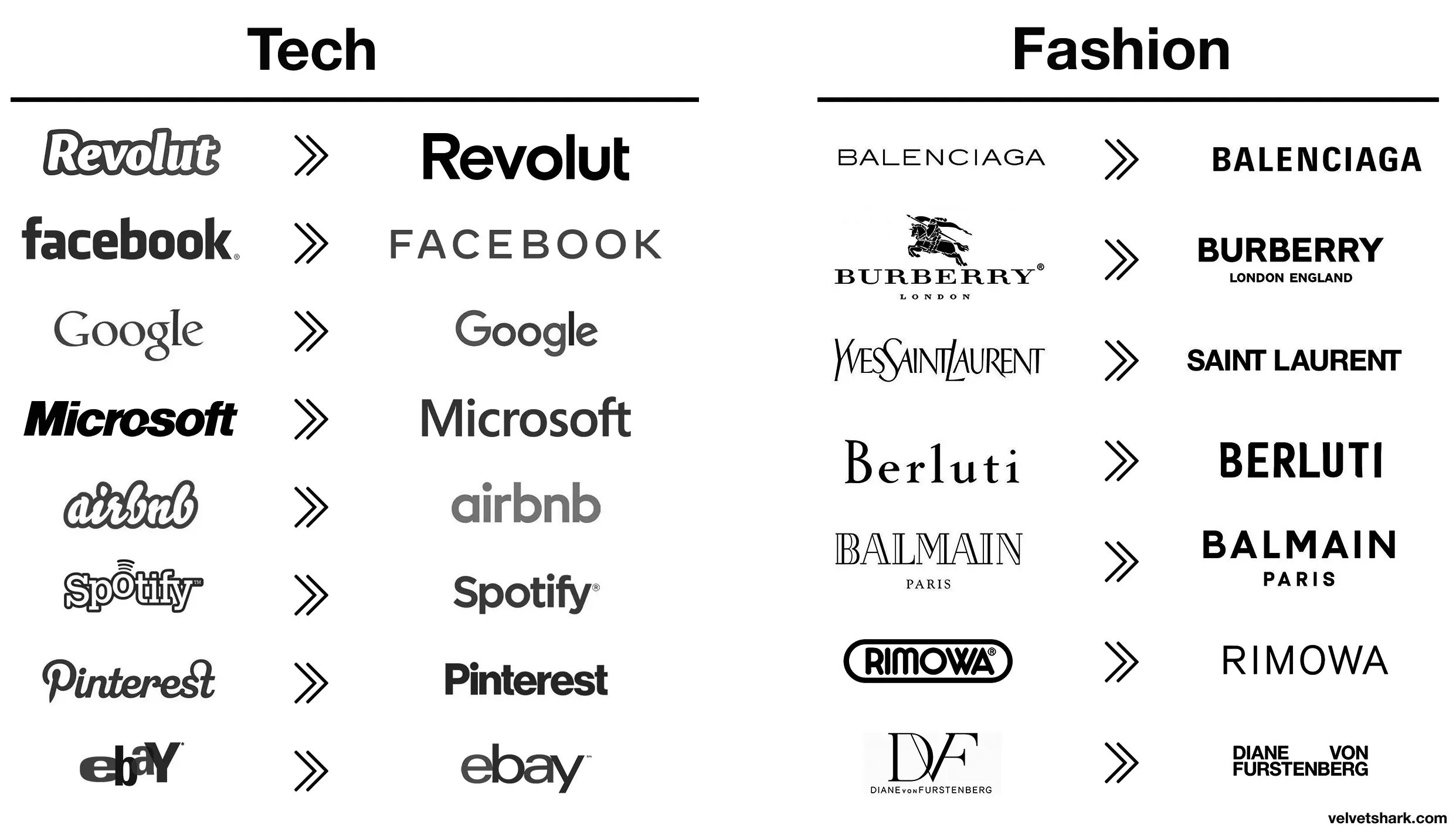
Those old fashion logos are actually sick. Concerning that an industry that sells style would make these their logos.
Comment on You know what, fuck you [un-Jags uar icon]
m_f@midwest.social 1 year ago
electric@lemmy.world 1 year ago
naught101@lemmy.world 1 year ago
Except eBay, that was always trash.
SubArcticTundra@lemmy.ml 1 year ago
Their business is literally selling people’s trash so it’s amusingly appropriate lmao
Bezier@suppo.fi 1 year ago
I wonder how much correlation there is between logo blandification and being owned by giant corporations.
RememberTheApollo_@lemmy.world 1 year ago
All these minimalist labels save .0005¢ every time they’re printed, probably even more on promo booths, banners, and the like.
BrowseMan@sh.itjust.works 1 year ago
Aaaah then indeed that makes sense (and this is not ironic).
RememberTheApollo_@lemmy.world 1 year ago
Oh, I wasn’t being entirely serious, though there is an element of truth to it. It probably is a measurable cost savings over the scale of the business.
I still think these unremarkable corporate logos are boring AF. Just makes them visually soulless along with just being corporate soulless.
BrowseMan@sh.itjust.works 1 year ago
I completly agree these logos are boring. The brand lost so much character and flare.
However I totally see “cost less” as one of the reason why these changes were pushed (especially for clothing brands).
Rinox@feddit.it 1 year ago
I think it has more to do with being readable on small screens, like mobile phones. It still doesn’t make sense to me to completely remove your logo and replace it with a sans serif name of your company like jaguar just did.
Hackworth@lemmy.world 1 year ago
All the companies are gonna form up like Voltron over the next decade or so, leaving a handful of megacorporations to lord over our cyberpunk dystopia. It’s just easier if all their logos already look the same.
FangedWyvern42@lemmy.world 1 year ago
Spotify and EBay made the right choices here, the new logos are way better.
AusatKeyboardPremi@lemmy.world 1 year ago
It is subjective, I liked the old eBay logo more, but dislike the old Airbnb one.
AnUnusualRelic@lemmy.world 1 year ago
Well, they certainly fin in better with all the others.
SuperSaiyanSwag@lemmy.zip 1 year ago
Slightly misleading without showing the color, only slightly though
selokichtli@lemmy.ml 1 year ago
What’s the reasoning behind? Or just a trend?
Viking_Hippie@lemmy.world 1 year ago
Better:
Worse:
The rest just go from meh to slightly different meh 🤷
naught101@lemmy.world 1 year ago
I liked the old aibnb one.
Microsoft went from “boring with a bit of attitude” to just plain boring
SubArcticTundra@lemmy.ml 1 year ago
Microsoft went from 90s corporate to 10s corporate
Zwiebel@feddit.org 1 year ago
DF gets points dedacted for missing the ü dots on both, looks absolutely stupid to a german speaker
FelixCress@lemmy.world 1 year ago
Spot on.