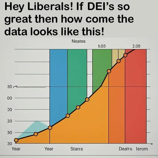
Ah, yes, I see the Year to Ierom ratio is heavily stacked in the Ierom end.
Nice AI graph.
Submitted 1 year ago by fossilesque@mander.xyz to science_memes@mander.xyz
https://mander.xyz/pictrs/image/6e3cc0c4-43b0-4e2d-a77a-31d48192584d.png
Ah, yes, I see the Year to Ierom ratio is heavily stacked in the Ierom end.
Nice AI graph.
Like what? AI-generated?
Presumably the joke is that all “data” republicans use to prove DEI is harmful is actually fabricated. Lazily.
The trend is good because it goes up and like a right hand gesture. Graphs that go like the left hand are inefficient.
- Elon.
Neates!
This chart has too many colors.
Gay.
I immediately went to the y-axis to see how they normalized it, only to find well there really isn’t much of a y-axis.
”year”, ”year”, …
Yes this makes sense
We’ve had one year yes but what about second year?
I don’t think Elon knows about second year.
introvertcatto@lemmy.blahaj.zone 1 year ago
What even is this supposed to represent?
marcos@lemmy.world 1 year ago
Looks like somebody asked an LLM to generate a bullshit graph…
What may be its optimal application!
DonGirses@lemmy.world 1 year ago
can’t even be bothered to open excel and whip up a graph in 2 minutes
instead we get AI slop
Rolive@discuss.tchncs.de 1 year ago
Generating bullshit is it’s main feature.
skillissuer@discuss.tchncs.de 1 year ago
that’s just regular fox news chart