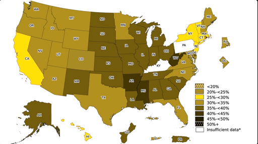
I first got this realization when I started using grey scale mode for my phone at night. A “good to bad” scale in an app became unintelligible. Since then I try to consider colorblindness if I design stuff myself. It’s fantastic if color scales carry meaning in both their colour but also the same meaning in their lightness, so everyone can understand them the same.
Comment on I live in the green part
Ellvix@lemmy.world 1 year agoSimulated red/green colorblind (the most common one)
Opisek@lemmy.world 1 year ago
Schmoo@slrpnk.net 1 year ago
This is how I see the map. Didn’t notice CO was green until a comment mentioned it.
Psythik@lemmy.world 1 year ago
That’s cause red and green both look like puke green to people with the most common type of colorblindness.
TriflingToad@sh.itjust.works 1 year ago
it’s really just a Gameboy huh
Psythik@lemmy.world 1 year ago
If a GameBoy could reproduce shades of blue and yellow too, then yeah, like a GameBoy.