TL;DR Somebody made an awful mistake rendering this map.
It’t not exactly the European portion but most of its recognizable parts (Kola peninsula, Caucascus…) because of the horrible SVG compression that deleted vertices presumably by count rather than keeping the most significant* ones. Just look how the Mercator/shrunk versions differ from each other and from an actually good map!
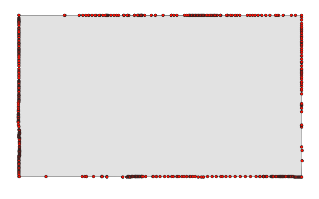
* A simple illustration would be Colorado, originally defined as a (Mercator) rectangle (between meridians and parallels) but ending up a 697-sided polygon (still way fewer than most surveyed administrative areas that size) largely because of surveying errors. However, if you pick the 1ˢᵗ, 175ᵗʰ, 349ᵗʰ and 523ʳᵈ vertex, you don’t approximate the shape nearly as well as by picking the 4 corners of the defining rectangle.
Image
And because corners are always mostly convex (they have to be because turns add up to 360° for closed areas), this compression will remove area more frequently than add it. This makes the map quite disingenuous (maybe not intentionally), as it amplifies the effect OOP was trying to show.
If I were a full-time Lemmy commenter, I’d download the Colorado polygon from OSM, import sone geo-libraries into Python and do all 174** combinations of picking the 1ˢᵗ, 175ᵗʰ, 349ᵗʰ and 523ʳᵈ vertex, visualize each quadrilateral as a video frame and
** Technically 697 options because 697 is not divisible by 4. But only ¼ of them are fully distinct, as every consecutive 4 maps have an identical starting vertex and just differ in which pair of vertices is 175 apart as opposed to the normal 174.
mEEGal@lemmy.world 2 months ago
No, it just can’t be scaled down and somehow kept in place at the tame time
LodeMike@lemmy.today 2 months ago
Its distorted on the Mercator projection quite a bit because of its width. So the true shape looks very different presented like this.