For some reason the combination of pointed corners on the wide stroke and rounded ends on the thin strokes bothers me.
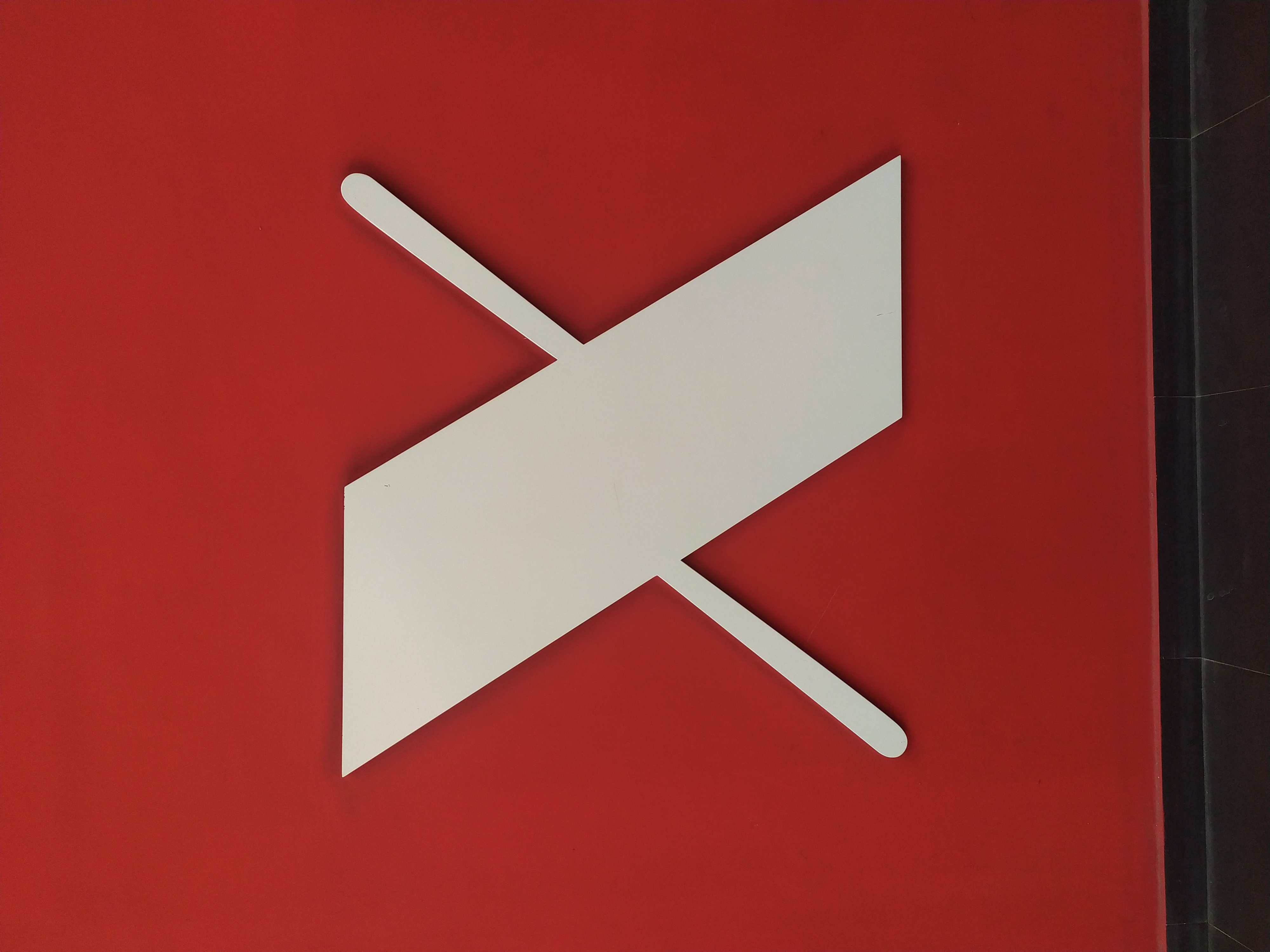
the way the x is not aligned
Submitted 2 years ago by lzs_jinxin@lemmy.world to mildlyinfuriating@lemmy.world
Comments
waz@lemmy.world 2 years ago
intensely_human@lemm.ee 2 years ago
It implies two sides of a thicker line.
Sephtis-6@kbin.social 2 years ago
If you mean that it isn't centered in the pic it would also infuriate me. Like all other non centered logos
Emperor@feddit.uk 2 years ago
I think they mean that the narrower crossbar is not a single straight line.
ech@lemm.ee 2 years ago
More infuriating is that it’s the wrong way around. The flat ends are the top and bottom, not the sides. Of course it looks bad like this.
lzs_jinxin@lemmy.world 2 years ago
Yeah i meant the narrower crossbar, but the image was flipped somehow and came out wrong when i uploaded it